Hacker Newsnew | past | comments | ask | show | jobs | submitlogin

Yeah, right. Remove all the whitespace. While you at it also make fonts smaller so that you can cram more data into the same space.

Some people actually like interfaces to be aesthetically pleasing. And whitespace is one of those things that really helps to make ui usable and clean.


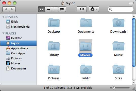
Here's an example of what I'm talking about (notice the border):

* Finder in 10.4: http://miki.samborsky.de/files/article/2008/LeoIcon/Tiger-Fi...

* Finder in 10.5-10.6: http://www.askdavetaylor.com/3-blog-pics/mac-finder-places-m...

* Finder in 10.7: http://gavinsmith.me/wp-content/uploads/2011/02/Screen-Shot-...

And whitespace is one of those things that really helps to make ui usable and clean.

You missed "the right amount of" before "whitespace".


Guidelines | FAQ | Lists | API | Security | Legal | Apply to YC | Contact

Search: